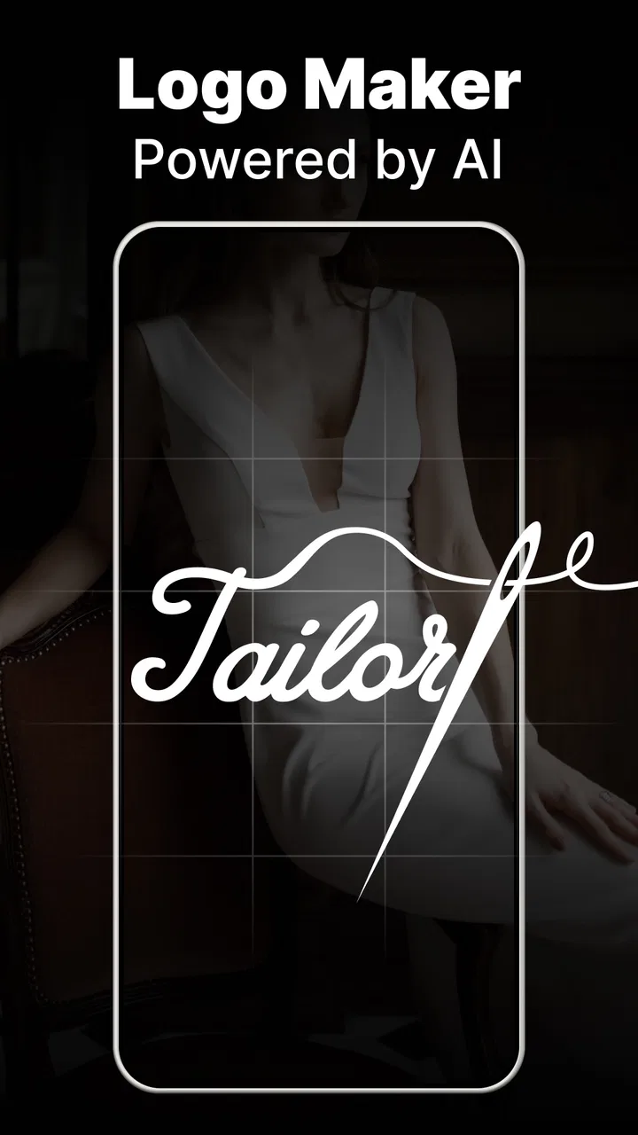
Logo Maker - AI Art Design
- 4.4
- Rating
- 1.00M
- Installs
- Free
- Price
 Analysis by App-foxy
I found Logo Maker - AI Art Design most useful when I stopped treating it like a complete branding studio and used it for what it does best: helping me move from a vague idea to a presentable logo concept quickly. It is an art and design app from Smart AI DEV, aimed at people who want to create a custom logo without opening a complicated desktop editor. The basic download is free, and the app is suitable for everyone, although some items and tools are offered through in-app purchases.
My first impression was that the app is built around speed rather than a long design process. That makes sense for a small business owner, a student, a social media creator, or anyone who needs a recognizable mark for a project today rather than after several hours of learning. The AI-powered approach can give you a starting point when you know the mood you want but do not yet have a strong visual direction.
At the same time, I would not mistake it for a replacement for a professional identity package. A quick logo generator can help with an early concept, a profile image, or a temporary project mark, but a serious brand still needs careful decisions about typography, spacing, color use, and how the design works at different sizes. That distinction shaped my experience with the app: it is most valuable as a practical shortcut, not as a promise that every result will be ready for a major company.
You May Also Like

 Blood Strike: 2.5 Anniversary
Blood Strike’s Loadouts Turn Every Drop Into a Tactical Gamble
A close look at Blood Strike’s custom loadouts: how fast access to signature weapons reshapes its battle royale rhythm, rewards preparation, and narrows the gap between fights.

 Pandora - Music & Podcasts
Pandora’s Music Is Easy to Start, but Harder to Recover
Pandora’s strength is its low-effort path from a seed to a station. Its weak spot is how much confidence it asks you to place in connection, setup, and quiet recovery.

 8 Ball Pool
 Is Built on Rivalries, Rematches, and Routine
A close look at the rivalries, rematches, shared routines, and unanswered safety questions that turn a quick pool match into a persistent mobile community.

 Samsung Music
’s Quiet Strength Is Playing What You Already Own
Its reach comes less from spectacle than from dependable access to a personal library. That simplicity is both the app’s strongest retention engine and its ceiling.

 AccuWeather: Weather Radar
AccuWeather Review: A Quick, Clear Forecast for Everyday Decisions
For everyday plans, the best forecast is the one you can understand quickly. AccuWeather makes rain timing, radar, and local conditions easy to act on, with a few trade-offs.

 Hill Climb Racing
Why Hill Climb Racing Still Turns Crashes Into One More Run
A tiny car, a bumpy hill and one more upgrade: Hill Climb Racing keeps resurfacing because its simple chaos makes every near-miss feel personal.
More From Our News Desk



Getting from installation to a usable logo
I’d start by deciding where the logo needs to work, because that choice gives the first design session a practical goal rather than leaving you to judge images by appearance alone. I’d also write a brief that names the project, its audience, and the feeling I want it to convey; that small bit of preparation makes it easier to compare concepts and leads naturally to choosing a direction worth refining.
What the first-time user should expect
The app is called Logo Maker - AI Art Design, but the useful question is not whether it can create something attractive in seconds. The better question is whether it can help you make a decision. When I use an AI design tool, I want it to reduce the blank-page problem, suggest a visual direction, and let me refine the result without making me understand professional design software first.
That is where this app has a clear appeal. You can approach it with a simple idea such as “a friendly logo for a home bakery” or “a clean symbol for a gaming channel,” then use the generated direction as a visual conversation with yourself. Even if the first result is not the final answer, it can reveal whether your idea works better with a symbol, initials, a wordmark, or a combination of those elements.
I recommend beginning with a narrow purpose rather than a broad request. “Make a cool logo” gives you no useful standard for judging the result. A more practical brief includes the audience, the personality, and the main subject. For example, a local repair service might need to appear dependable and straightforward, while a handmade craft account may benefit from a warmer, more personal feeling. This small preparation makes the first session much more productive.
The app has reached over a million installs and holds a 4.3 average from around 31 thousand ratings, so it is clearly being tried by a substantial audience. Those figures do not guarantee that every generated design will suit your taste, but they do suggest that the app has found a place among people looking for fast logo creation on mobile.
Setting up the first project without overthinking it
After installing the app, I would keep the first project deliberately simple. Choose one name, one purpose, and one visual mood. Do not begin by trying to design an entire brand system with several versions, slogans, and color palettes. The first useful milestone is a logo that you can recognize at a glance and imagine using as a profile picture or small online image.
A good first brief might be: “Create a simple, welcoming logo for a neighborhood coffee stand, using a cup or bean idea, with a warm and modern feeling.” That gives the design process enough direction without forcing a particular layout. If you are making a logo for yourself, write down three words before starting. I find that three words are easier to apply consistently than a long paragraph of preferences.
It is also worth deciding where the logo will appear. A design intended for a circular social profile needs a different balance from one placed across a website header. A detailed illustration may look impressive on a large screen but become muddy when reduced. If your first use is a small avatar, favor a clear shape and limited visual complexity from the beginning.
The app runs on Android versions starting with 5.0, which makes it accessible on a wide range of devices. Its current version is 1.2.4, and the app was released on May 20, 2025. I would still approach the first session with patience on an older phone, especially when working with generated artwork or several edits in one sitting. Keeping the first project focused also makes it easier to tell whether a problem comes from the design itself or from the way you described the idea.
The first meaningful success is a comparison, not a perfect result
My most useful early habit with a logo generator is to create a small set of directions and compare them before becoming attached to one. Instead of endlessly polishing the first attractive image, I look for differences in personality. One version may feel energetic, another trustworthy, and another too decorative for the intended audience. That comparison is more valuable than simply asking which image looks nicest.
Once you have a promising direction, inspect it at two imaginary sizes. First, picture it large enough for a page header. Then reduce your attention to the size of a small profile icon. If the central idea disappears at the smaller size, the design needs simplification. This is one of the less obvious trade-offs of AI-generated logos: visual richness can make the result seem finished while weakening its recognition in everyday use.
I also recommend checking the lettering separately from the symbol. A logo can have a strong icon but an awkward name treatment, or attractive text paired with an image that feels unrelated. Read the name aloud and look at it without the symbol for a moment. If the wordmark is difficult to read or the style does not match the project, do not let a striking illustration distract you from that weakness.
For a first-time user, a successful action might simply be saving one concept that is clear enough to show another person. Ask a friend what kind of business, channel, or project they think it represents without giving them an explanation. Their immediate reaction can reveal whether the design communicates anything or is only visually pleasing. This informal test is often more useful than staring at the screen and changing small details repeatedly.
Where the AI approach helps, and where it needs supervision
AI tools are particularly helpful when you have a subject but no visual vocabulary. You may know that you want a logo connected to travel, fitness, food, music, or education, yet have no idea whether the mark should be geometric, illustrated, minimal, or playful. The generated options can expose possibilities that you might not have considered on your own.
However, I would treat every result as a draft that needs human judgment. AI can produce a polished-looking image that is too generic, overly detailed, or poorly matched to the name. It may also lean toward familiar visual patterns because those are easy to recognize. If your goal is distinctiveness, do not accept the first design simply because it looks professional at a glance.
One practical technique is to describe what you want to avoid as well as what you want. If the project should feel calm, mention that it should not look aggressive or crowded. If the audience is children, explain whether you want friendly rather than childish. These distinctions help you judge the output more carefully, even when the app’s generated direction is not exactly what you imagined.
Another useful technique is to separate concept discovery from final selection. During discovery, allow unusual ideas and unexpected combinations. During selection, become strict: remove anything that is hard to read, too close to a familiar symbol, or unlikely to work in a single color. This two-stage process prevents the excitement of generation from replacing the discipline of choosing.
Common confusion during editing and selection
The first common confusion is assuming that a generated logo is automatically a complete identity. It is not. A logo is only one part of how a project appears. You may still need to decide how to use it on a light background, a dark background, a social profile, or printed material. Even if the app gives you a design you like, test the idea in the places where people will actually see it.
The second is judging a logo only on a large phone screen. Details that look elegant while zoomed in can become clutter when the image is small. I often place my attention on the overall silhouette first, then the text, and only afterward on decorative details. If the silhouette is weak, adding more decoration usually makes the problem harder to solve.
A third point of confusion concerns originality. A familiar icon can communicate quickly, but it can also make the logo feel interchangeable with many others. If the generated concept relies on an obvious object, look for a distinctive arrangement, letter treatment, or negative-space idea before accepting it. The goal is not to make the design mysterious; it is to make it recognizable without becoming forgettable.
There is also a practical cost question. The app is free to download, while in-app purchases range from $6.99 to $59.99 per item. I would explore the free experience and decide what kind of work I actually need before paying for anything. If you only need one simple concept for a personal project, a paid option may not be worthwhile. If the app becomes part of repeated content creation, the convenience may matter more, but I would still compare the purchase against a conventional design app or a one-time commission.
The age rating is Everyone, which fits the broad, general-purpose nature of the tool. That does not mean every design is automatically suitable for every professional setting. A logo for a school activity, a personal account, and a regulated business may require very different levels of review. The app can help with visual exploration, but responsibility for the final choice remains with the person using it.
How it compares with familiar alternatives
Compared with drawing a logo from scratch in a general illustration app, this tool gives a beginner a faster starting point. A blank canvas offers more control, but it also demands more knowledge about shapes, layers, typography, and composition. If you are comfortable building everything manually, a dedicated editor may produce a more controlled result. If you are stuck at the idea stage, the AI-assisted route is likely to feel more approachable.
Compared with template-based logo makers, the main attraction here is the possibility of beginning with a description rather than browsing a large collection of prebuilt layouts. Templates can be efficient when you already know the style you want, but they can also lead to logos that feel familiar or only lightly customized. AI generation may offer more surprising starting points, although those ideas still need careful editing and selection.
Compared with hiring a designer, the app is much quicker and more accessible for a small personal project. It cannot replace the research, strategic thinking, and iterative communication that a good designer brings to a serious brand. I would choose the app for a test project, a temporary event, a new content channel, or an early business concept. I would look elsewhere when the logo must support a long-term identity across packaging, signage, campaigns, and multiple languages.
Who will get the most from this app
I think it is a strong fit for first-time creators who need visual momentum. A student launching a club, a freelancer setting up a personal page, or a small seller preparing a simple online presence can use it to get beyond the empty-canvas stage. The app is also useful when you need several possible directions before deciding what kind of logo feels right.
It may be especially helpful for someone who understands their audience but does not know design terminology. You do not need to begin with words such as “monogram,” “negative space,” or “geometric sans serif.” You can describe the feeling and subject in ordinary language, then evaluate the results with practical questions: Is it readable? Does it fit the project? Will I recognize it when it is small?
I would be more cautious if you need exact control over vector paths, a carefully engineered type system, or guaranteed consistency across a complete brand package. I would also skip it as a final solution if your project depends on a highly distinctive mark and you do not have the time to review and refine generated concepts. In those cases, a professional design workflow is the better investment.
A realistic everyday workflow
Imagine that I am helping a friend open a small weekend dessert stall. The name is chosen, but there is no sign, social avatar, or menu mark yet. I would start by writing three traits: cheerful, homemade, and easy to recognize. I would then describe the business clearly, generate several directions, and reject any design that is too detailed to work on a small menu label.
Next, I would compare the strongest concepts in a simple way. Does the icon still make sense without the business name? Is the name readable against a plain background? Does the design look appropriate beside a price list rather than only in the app’s preview? If one concept works better in all three situations, it is probably the more useful choice, even if another looks more dramatic on the phone.
Before sharing the result, I would ask my friend to view it without the explanation. If they see a dessert business, a cheerful local service, or at least the intended tone, the app has done its job as a starting point. If they see something unrelated, I would return to the description rather than trying to rescue the image with endless small changes.
My next-step advice after the first logo
Once you have a direction, stop generating endlessly and write down why it works. Is it the shape, the name treatment, the mood, or the way it remains clear when reduced? This short explanation becomes a useful filter when you create a second version later. It also prevents you from abandoning a strong concept simply because a newer result looks more fashionable.
Then prepare a small usage check. View the logo as a profile image, imagine it on a simple document, and consider whether it would remain recognizable in one color. These tests do not require advanced design knowledge. They simply reveal whether the logo is practical beyond the app screen.
If the result is for a business, I would also treat it as a draft until I have checked that it does not closely resemble a competitor or a familiar symbol in the same field. The app can help you create an appealing idea, but it cannot make your business decisions for you. A few minutes of comparison and reflection can prevent a confusing choice later.
Smart AI DEV has positioned this app as a quick route into logo creation, and I think that is the right way to understand it. The free entry point, Everyone rating, and support for Android 5.0 or later make it approachable, while the paid items mean frequent users should consider their needs before unlocking more. With a 4.3 average and over a million installs, it has enough real-world interest to deserve a look, but the final quality still depends on how thoughtfully you guide and judge the results.
My recommendation is simple: try Logo Maker - AI Art Design if you need ideas quickly, dislike starting from a blank canvas, or want a usable concept for a small project. Give yourself a clear brief, compare several directions, and test the strongest one at the size where people will actually see it. Use the generated design as a starting point, not as a substitute for judgment. For a first meaningful logo, that balance makes the app genuinely useful; for a fully developed professional identity, I would move to a more controlled design process.
FAQs for Logo Maker - AI Art Design
01What features does Logo Maker - AI Art Design offer?
Logo Maker - AI Art Design provides a comprehensive suite of tools for creating professional logos with ease. It includes AI-powered design assistance, a vast library of templates, customizable fonts, and color palettes. The app also supports vector export, ensuring high-quality logos that can be scaled without losing resolution.
02Is Logo Maker - AI Art Design user-friendly for beginners?
Yes, Logo Maker - AI Art Design is designed with beginners in mind. The intuitive interface guides users through the design process, with AI suggestions to enhance creativity. Step-by-step tutorials and a user-friendly layout help newcomers create impressive logos without prior design experience.
03Can I use Logo Maker - AI Art Design for commercial purposes?
Yes, the logos you create with Logo Maker - AI Art Design can be used for commercial purposes. The app allows you to design unique logos for your business, brand, or personal projects. However, it’s advisable to check the app’s licensing terms to ensure compliance with commercial use policies.
04Does Logo Maker - AI Art Design offer customization options?
Absolutely. Logo Maker - AI Art Design offers extensive customization options, allowing users to modify templates, fonts, colors, and shapes. You can add personal touches to your design, ensuring it aligns with your brand identity. The app’s flexibility caters to both simple and intricate design needs.
05Is there a cost associated with using Logo Maker - AI Art Design?
Logo Maker - AI Art Design offers both free and premium versions. The free version includes basic features and templates, while the premium version unlocks advanced tools, exclusive templates, and additional design elements. Users can choose a subscription plan that best fits their needs and budget.
Pros
- Easy-to-use interface for beginners.
- Wide variety of templates available.
- AI-driven design suggestions.
- High-quality export options.
- Customizable fonts and colors.
Cons
- Limited free features without subscription.
- Some templates feel generic.
- Occasional lag on older devices.
- In-app ads can be intrusive.
- No offline mode available.

Logo Maker - AI Art Design
Gallery